Labels

Showing posts with label Research and Planning. Show all posts

Tuesday, 30 April 2013

Creating the website


To create our website we used www.wix.com We found it a lot simpler to use over Weebly (which was the other option for creating our website). Wix allowed us to create the website much more quickly and to a higher quality than most other sites. 


Above are 5 screenshots from creating the website. We literally started with a blank template, first adding our final logo at the top. We wanted to keep the theme running the same throughout, and used images from our digipak on our website. We secondly created a side bar, with the other albums/songs available from the band on there. We then added the background, this was an image from our Digipak. We then added the different links, checked they worked. The last thing was to add the final video to the homepage.  

Our final logo

Once we had researched into several other logos we had an idea in our head of what we wanted ours to look like, and decided that using a web font designer was the wrong thing to do. We wanted our logo to have a nice flow to it, and so we decided to hand draw it. Dom drew the logo and then we scanned it onto the computer and were able to use it on our website/digipak.


Digipak Creation

One of our tasks was to create a Digipak to go with our video. The Digipak is for an album of the band in which the song we used to create our video from is. We again looked at conventions and the branding of the band. The original bands website was a large influence to me when creating the look and style of the digipak. It's colour pallet contains mainly blacks and greys without almost any other colours being present. I started by looking into the sort of digipak we would use and then decided on this.


Once the type was decided the group gave their opinions on what should be placed where on the Digipak, with the following all being factors which needed to be included in the product.
- Defeater Logo
- Managing company's Logo (Bridge Nine)
- Album Name
- Song Titles
With the addition of Some lyrics and photo stills from our video, which was a design choice.

I started the creation by editing a still from the video. This was the front cover of the product.
To create cover art i took the still and changed the contrast, brightness and colour saturation. I then cropped part of the image and copied it, mirrored it and changed the transparency of all 4 images to create the background.
Then i asked a group member to write Defeater in a close yet different way to the current logo. The new logo was scanned onto the computer and a few small edits and cleaning was done to the image. For example the trailing part of the D was shortened and a few small white specks in the letters were blacked out.
Once this was done I placed the background onto the template and added the new logo, the bridge nine logo and the production company logo which was created by myself towards the start of the project onto the cover as well. The finished cover looks like this.


The song titles side was created by using a still from our shoot and making it very dark, mirroring it, cropping it and finally rotating the image. The text was then placed onto and both were added to the template. The disc holder side also uses the same image without the text, and the image was also flipped.


The remaining blanks in our digipak are filled with colour corrected and minor edited stills from our video. The train track image for example has had some blurring also done.


Quickly created mock ups were also done for some panels but I didn't further use any of them.

Logo Research

Since we had to design our own logo, which would be used across all of our products, I decided to look into other logos that artists/bands use.


Above is the logo that acoustic artist Ed sheeran uses. His signature symbol is the paw print, so this is included at the end of the logo. It is fairly simple, but the text itself is too simple for us to base ours on.

   
Above is the logo that acoustic/country singer Taylor swift uses, which again is very simple. Acoustic artists do tend to keep their logos simpler than some other bands. This logo is something we helped base our logo on. The font seems to flow better and defiantly looks nicer than some other fonts.

  
Above is the logo for rock band all time low. Although not an acoustic act they have a well done logo. The same as Ed Sheeran's it includes both text and their signature logo, which is the little skull. The font itself is quite bold and not something that we were looking to re create.

Editing

When we started to edit our video we first I had to import the clips we needed from the camera and filter out any which we didn't needed (since we filmed extra to make sure) we uploaded the song into the editing timeline and started slowly putting the different clips together.
Once we were happy with the rough cut, we decided to test out effects and transitions that would improve the video. We decided on several 'fade' effects and since the song was quite sad we decided to include effects to match the narrative of the story.


We decided to use a 'Black and White' effect (that I looked into in previous posts) once the narrative in our film reached it's depressing plot line. This was so it was it would relate the audience, because they would see how it was affecting the character and would be empathic towards him. Below is a clip from Adobe Premier pro, showing the effects we used such as "Cross dissolve" and "Fade" and how it links the clips together.  


Props

When filming the video we didn't actually need many props at all. All acoustic music videos are different with the props they use, as the props normally match strongly with the narrative of the story. However one thing we did use (which a lot of videos use) is an acoustic guitar. In most videos either the character or the artist themselves will play along with the actual song, often cutting from narrative to the guitar playing.


The use of acoustic guitars is common in many acoustic/folk/country videos from Ed Sheeran to Bob Dylan.
  

Tuesday, 23 April 2013

Colour correction research

Over the course of the filming process we have been looking into colour correction, since we want to have half of the video in black and white to show a more depressive tone after the couples break up. We discovered that if you go into Adobe premier pro (which we use for all video editing purposes) there is an effects bar. Then under "effect controls" which allows us to change colour contrasts and filter levels. We can create black and white film by removing all colour from the clip and then moving the black and white contrast up.

As well as black and white filters, the colour wheel allows us to change the "warmth" of a picture, by turning the warmth up you can create a brighter image, something which we may do create the impression of summer if the footage does look darker than we would like when it comes to editing.

Costumes

For costumes we tried to get a more average look on the characters. We wanted the audience to be able to relate to the characters, and be able to understand the story and put their own situations to that of the video. We tried to dress Jordon in just jeans and a hoodie, and he also wore a cap. It was just easier for him to look like an average guy, going through relationship problems. We tried to dress Lauren to match Jordon  so just jeans and a plain purple top.

For us it was key that the characters looked similar to show they were equal in the relationship, and not one was better/more attractive than the other. We used fairly plain clothing instead of branded items, the last thing we wanted was big brand names to detract from the actual video itself.


Above is a shot of the two characters walking side by side (taken from the video, hence the bad quality). Since we set the video in two different time frames (before and after the couple have broken up) we had to dress Jordon twice, once for when they were together, and once after they had broken up. We wanted to have two separate outfits to distinguish the time difference. 


Above is a shot of Jordon dressed for after the break up has happened. We kept it fairly similar, jeans and hoodie being a standard theme. Its a different hoodie, with no logo at all. We also added a cap, just to make it clear that the two time frames were totally different. 

Filming!

When filming began I made sure I took photos as proof. Also you can see in these shots that we are using our own camera (which Lauren from our group owns). We decided that we wanted the best quality video so we decided to use her Fuji film camera as the quality of image was much clearer. Luckily the weather on this day was good, and no rain. There were a few occasions that we began to film, it started raining so we had to stop and go back on another day. We managed to get most of the work done on this day though, which gave us a lot of time to go and edit the piece together. 


Permission for song use


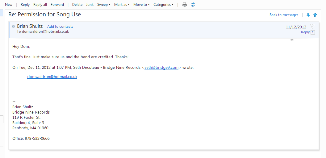
We got Dom to email the record label that defeater are signed to, and make sure we could use the song for our media piece. Above is the screen grab of that email and the reply. In some cases for bands they wont actually reply to emails (possibly because they get so many) so it was good that we were given permission for the track.  

Website codes and conventions

I decided to do some research into website layouts before we constructed our own. I went to band websites and tried to find common themes, and some codes and conventions that we could use on our own website. We found that most band websites had a photo of the band or the band logo on the home page. We then looked at the tabs the band had included on the website. we found most sites included:

Home
Ask
Gig/Tours
Videos
Music
Merch
Blog

we didn't have to include so many tabs in our site, so we decided to pick the ones we found most commonly, Gigs/Tours, merch, Home and music were tabs we managed t find on the majority of band websites we looked at. Also a common theme seemed to be promoting the bands new single (or album) on the homepage of the website. We decided that our music video would be the main focal point on the website and be large on the home screen. There are also links to the bands twitter and Facebook page on many home pages, which is something we considered to include.

Below is a screen grab of Bring me the horizons website. You can see all the tab links in the bottom left corner, and all the social networking links in the bottom right.
   

Tuesday, 26 March 2013

Recce shots


We went out and took some shots of our location for filming. We tried to photograph all the key areas we would be filming in, to try and get the best idea of how it would look on camera. This was the second location we selected, after the weather made it impossible to use the other (original location). We decided that this location would be best as it is incredibly open, giving us more scope for creativity.  

Tuesday, 19 March 2013

Questionare


Here is a small questionnaire we created in order to get information on what people think makes a good music video. We each took a handful of these and handed them out to people in order to try and get the best possible video. We tried our best to keep the questions fairly simple.  

Slideshow

Here is a copy of the slide share we showed to the group and got our feedback on

Tuesday, 22 January 2013

Feedback from the group presentation

After having finally come up with a plan for our final idea for a music video, we created a power point presentation and then briefed the idea to the rest of the groups for feedback. Our presentation included our location for filming, (which will be Nine bridges, a location in Peterborough), how we plan to edit the video, what shots we will use and we also let the groups hear the song we wish to use. We received much positive responce, aswell as a few improvements we could make which we will take into account and add into our production as we go along. Our teacher also gave us feedback, and although he liked our initial idea he also suggested what else we could put into out music video.


Todorov's Narrative Theory


Equilibrium - Everything is normal - We get a sense of the setting and genre, thus allowing us to immediately connect to the narrative and characters of the music video.

Disruption - Something upsets the normal balance of life - The overall environment and video present a drastic change, which should be clearly recognised by the audience. To some this is where the actual narrative starts.

Recognition of disruption - Something effects the hero - In terms of music videos, the lead artist will portray a clear image of recognition towards the form of disruption. The 'disruption' does not necessarily mean something negative.

Attempt to repair disruption - The hero goes on his quest - After the lead artist has recognised a disruption of some sort, he/she will confront it and and the outcome will either be positive or negative.

Equilibrium is restored - The hero defeats the villain - Everything will go back to normal, however not exactly as it was at the start.

Tuesday, 27 November 2012

Location change

The first location we picked the video was miles away, and due to transportation and practicality we have decided to move the location.We will now be filming at "Cuckoos Hallow" which is only 5 minutes from school, it has several lakes, bridges, trees and areas of grass perfect for filming. At this location we can still carry out all the narrative ideas we had come up with, and its easier to reach if we need to re film. Shortly I will upload some photos of the location and a plan of the video itself (with lyrics) so we can see the idea more clearly and help us along with the filming.  

Tuesday, 13 November 2012

Metal mood board.

This is a mood board that we have chosen and created based on the Rock/Metal genre. This is likely to relate to the song we will choose as our final one. You can see the typical conventions of the band in this mood board, there are a lot of dark colours and clothing. However we might not apply these factors since although the song is from a band of this genre, the actual song is acoustic.

Artist research - Defeater


Defeater is a hardcore punk band who like to take "creative liberties" when crafting songs. According to guitarist Jay Maas, "There's a prevalent thing in this genre where if you're not doing what hardcore bands have been doing for the last 25 years almost verbatim, you're fucking up." Defeater also showed their softer side with the four acoustic tracks at the end of their second studio album Empty Days & Sleepless Nights.

Defeater is a concept band whose body of work features an overarching story-line told through multiple concept albums. The narrative highlights the hardships and internal conflicts faced by a working-class family living on the Jersey Shore during the post-WWII period. On why this era is of interest to the group, Maas said it's because, "it's seen as this period of great American prosperity but there was still a lot of racism, sexism and homophobia. We write about these prejudices and things like war and murder and how they affected real people. All these things definitely contradict those Norman Rockwell-rosy images of that period."